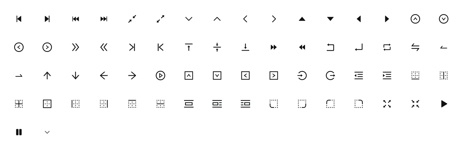
Icons
Overview
All icons in the UI should have a consistent style, including detail design, perspective, and stroke weight.
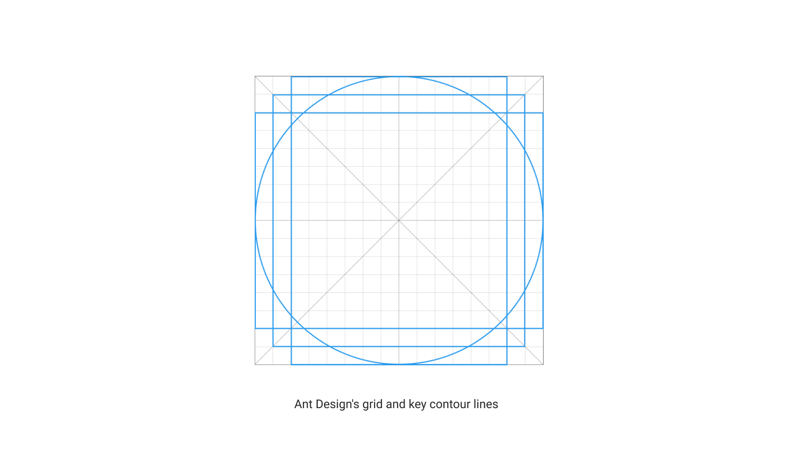
Base Grid
All icons will be built on a 16px x 16px pixel grid. Every part of an icon should be placed within this grid.
Icons then can be scaled down or enlarged depending on usage needs
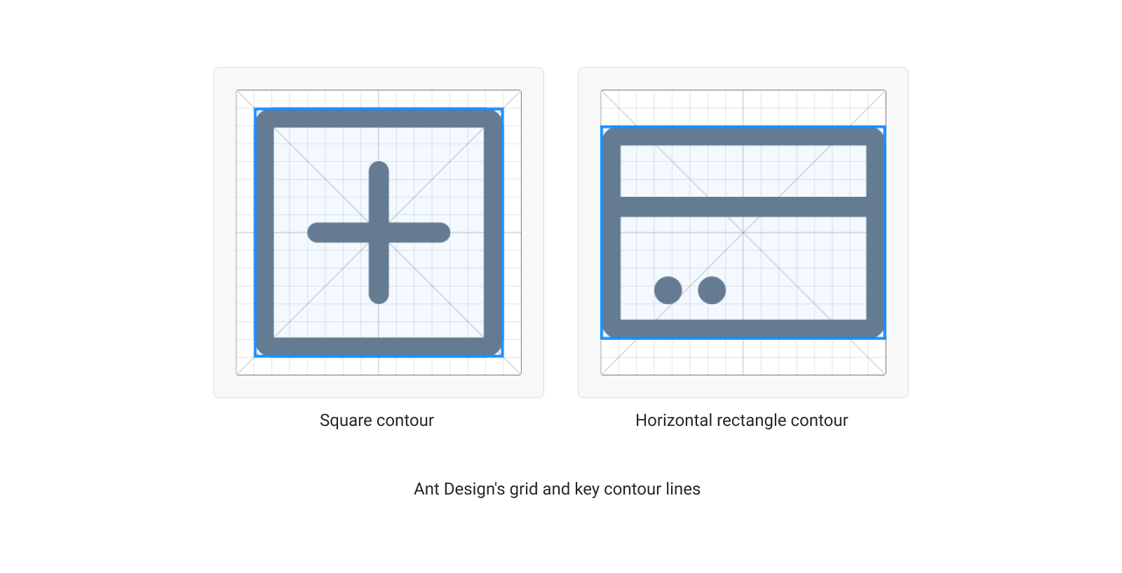
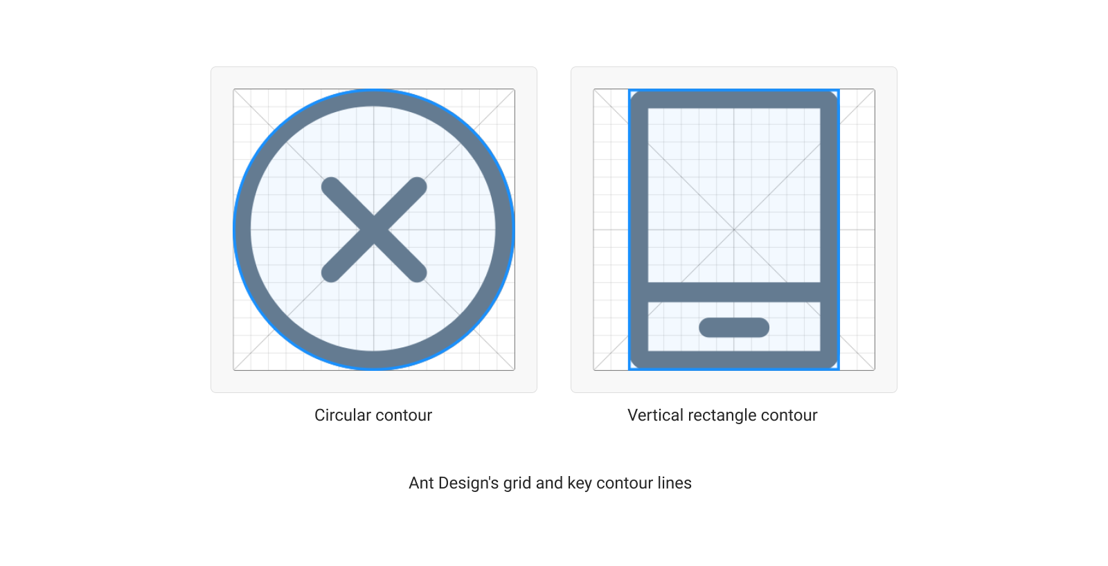
Key Contour Lines
Contour lines play an important role in making various icons with the same visual effect.
Ant Design's grid and key contour lines
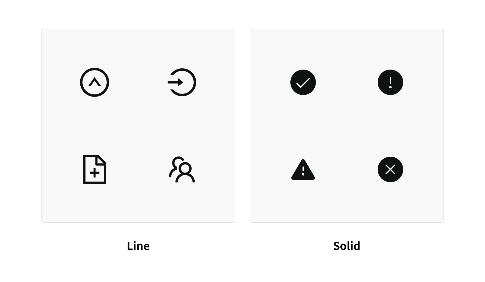
Type
Line icons and Solid icons
By default, all icons used are Line icons. We use Solid icons in three particular cases:
-
The icon is used to highlight the main action we want the user to perform (ex: on a CTA)
-
The icon is related to info that must catch the user's attention (ex: Semantic icon on a Toast)
-
The icon has an active state (ex: ⭐️ to show an item is a favorite)
Naming Conventions
Uniform naming conventions make finding icons faster and easier
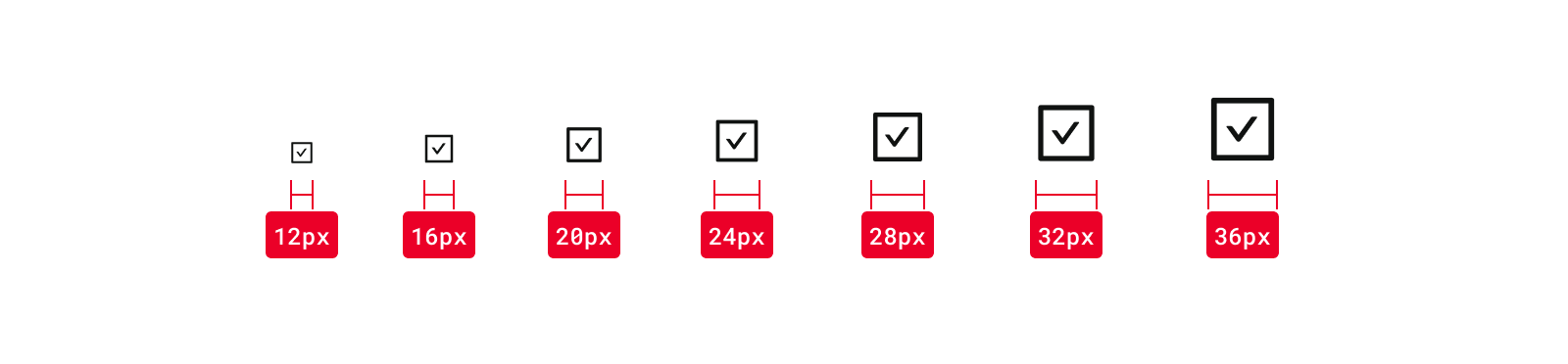
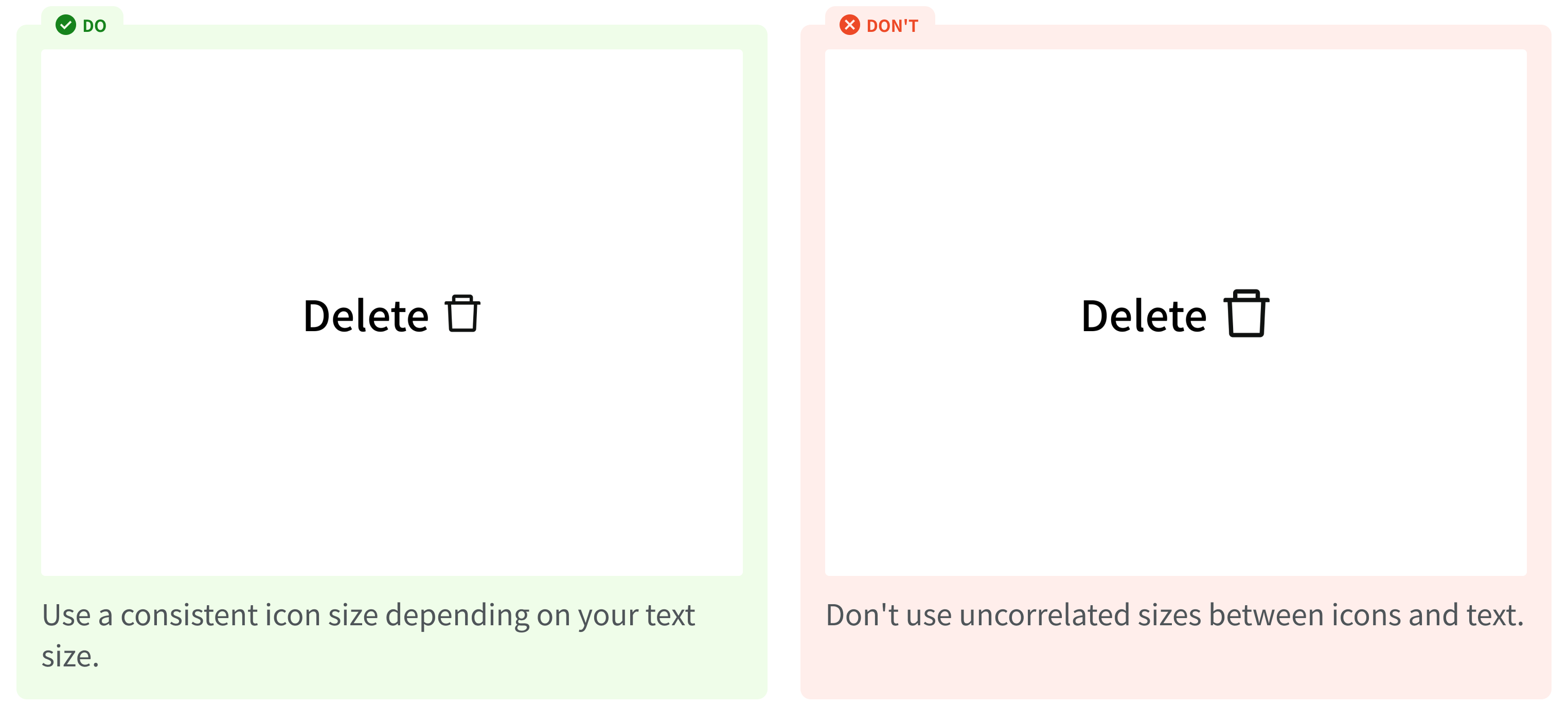
Icon Sizing
Icons should be scaled according to the text size
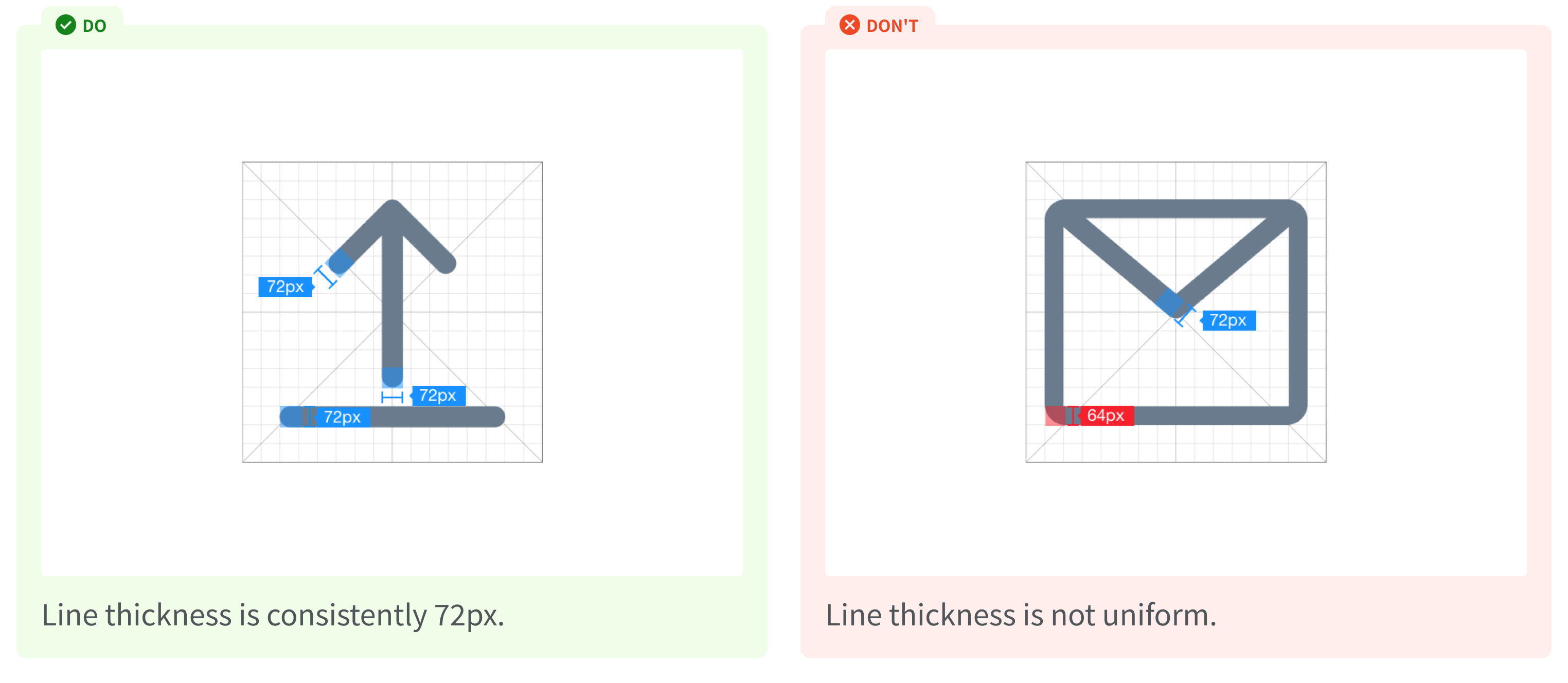
Stroke Weight
Consistent stroke weight is the key to maintaining the visual unity of the entire icon system. Ex: Ant Design's icons have a consistent line width of 72px.
Visual Correction
In certain special cases (for example, when the icon is too compact), adjustments to line width, outlines, or other subtle changes may be made to increase readability.
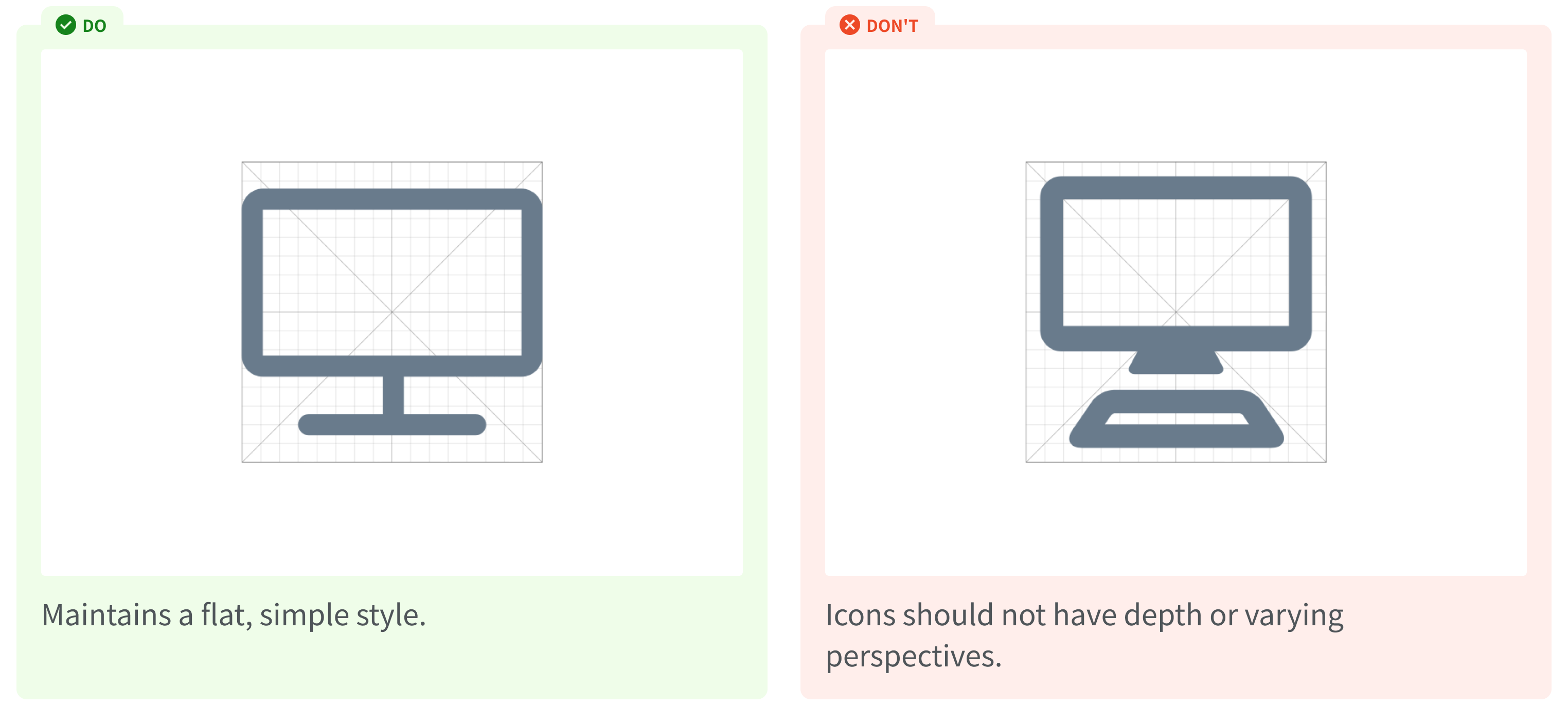
Perspective
Always keep a simple, flat style. Icons should not have a sense of depth or much detail.
Usage Guidelines
Sizing
Colors
Alignment
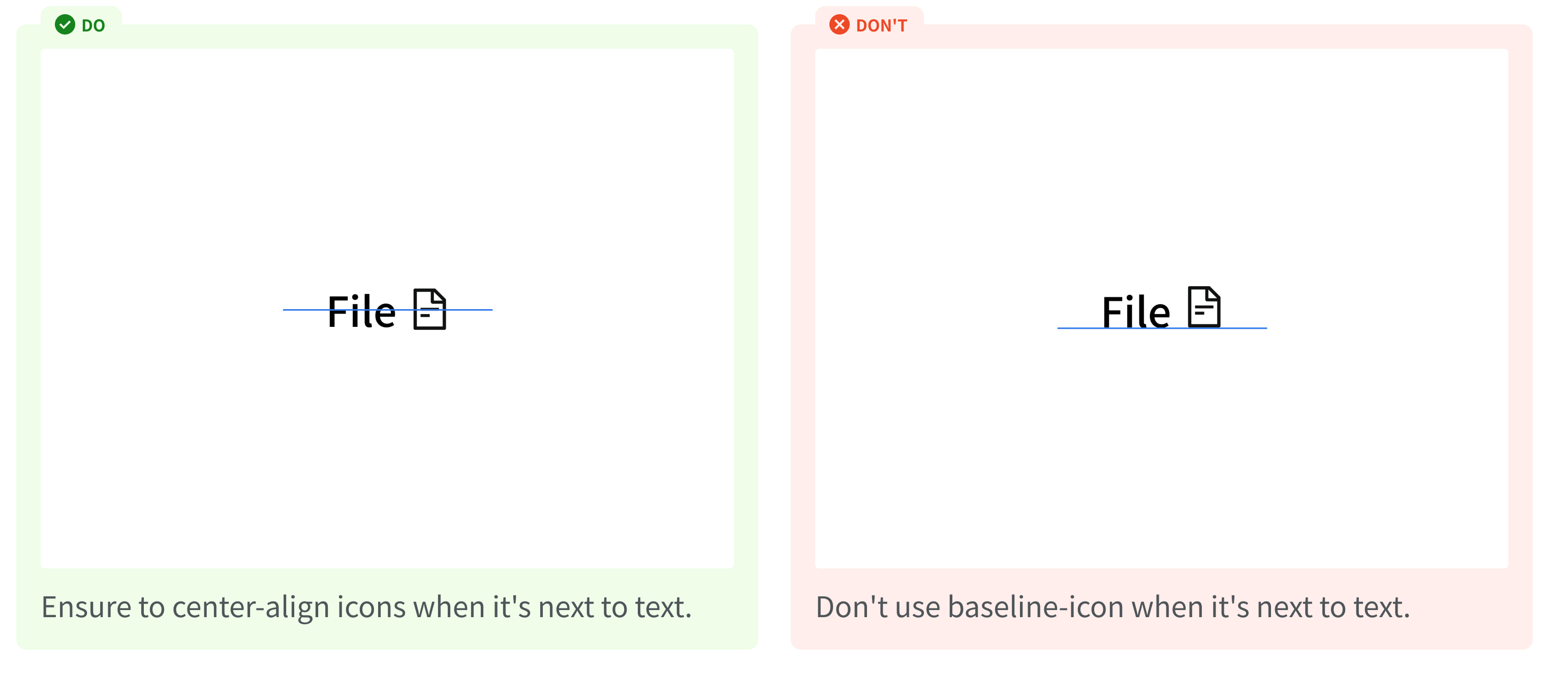